How do UI designers create sleek and elegant web designs? This question puzzled me each time I redesigned my personal website.
However, my understanding of web design fundamentals improved after reading the book Practical UI by Adham Dannaway. The book offered many useful tips on color, typography, layouts, and buttons. In this post, I’ll share key insights from the book that aided my latest website redesign.
Contents#
Color#
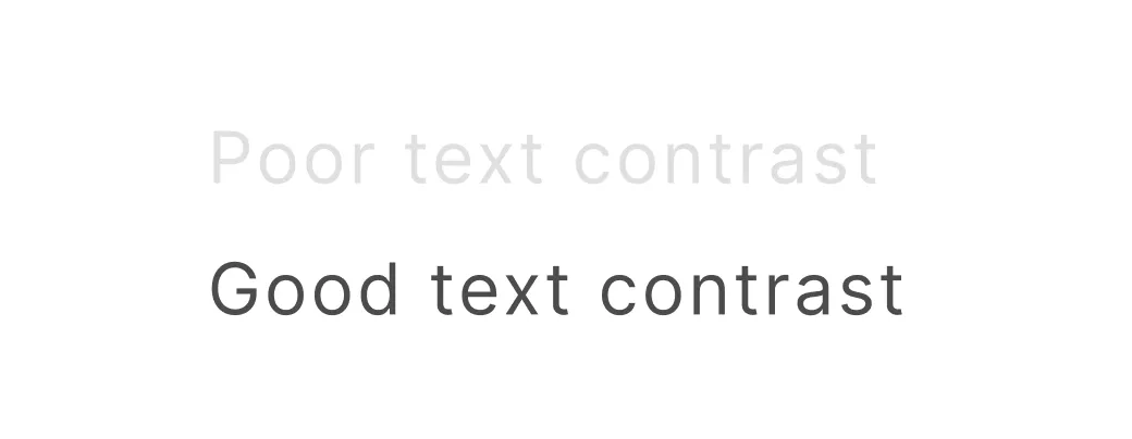
Prioritize accessibility when choosing colors. It’s crucial ensure sufficient color contrast in user interfaces for readability and differentiation.
Two standards for this include the Web Content Accessibility Guidelines 2 (WCAG) and the Accessible Perceptual Contrast Algorithm (APCA). Furthermore, tools such as the Chrome DevTools and the A11y Figma plugin can help address color contrast issues.
Embrace the HSB to create color palettes. Unlike RBG or Hex, the hue-saturation-brightness (HSB) is more intuitive for describing colors. Creating variations of a single color requires fixing the hue and adjusting and the saturation and brightness. Learn more about it here.
Highlight interactive elements using one color. This principle can provide a unified look to a design and minimize confusion. However, it isn’t always necessary to follow when it’s obvious that elements, such as nav bars, are interactive.
Typography#
Select a type scale for font sizes. Instead of randomly picking font sizes, pick a type scale. This involves choosing a base font size and scaling factor to generate a range of sizes. Here’s a handy tool for this.
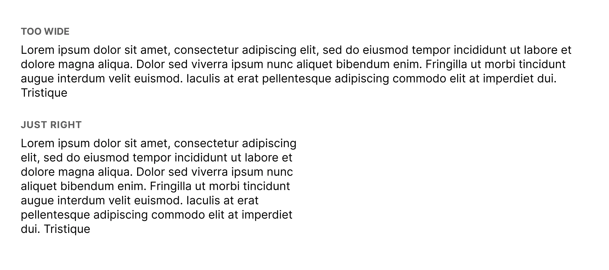
Keep line lengths between 40 - 80 characters. Lines that are too long or short disrupt the reading experience for users. I doubted this wisdom at first. But, there’s plenty of research to back up this claim.
Layout#
Limit spacing options for simplicity. This reduces friction in deciding how to space elements. It also prevents picking arbitrary spacing units, which can make designs look inconsistent. Nowadays, I use spacing units such as 2px, 4px, and integer multiples of 8px.
Apply the law of proximity. When two visual elements are closely associated, they should be closer together. This principle provides structure and organization in visual designs. Learn more about this here.
Buttons#
Avoid solely relying on color to establish a button hierarchy. Consider using shape and style to accommodate colorblind users. An easy way to do this is to use a filled button, unfilled button, and an ‘empty’ button for the primary, secondary, and tertiary buttons, respectively, as shown below.
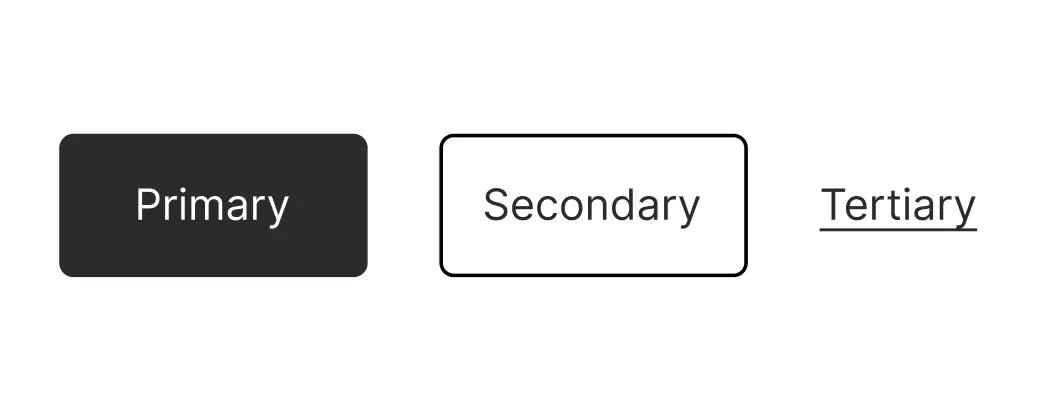
Use secondary or tertiary buttons when presenting the user with several options. Reserve the primary button for the most important option, as it for multiple options can be visually overwhelming. Hence, it’s better to reduce the visual weight of each option by using the secondary or tertiary buttons.
Require buttons to be at least 48 by 48 pixels in size. This ensures that buttons are easy to click.
Conclusion#
In summary, Practical UI introduced me to fundamentals of visual design that helped me redesign my website. This experience also sparked my deeper curiosity of UI design. I’m excited to elevate my design skills to create websites that are even more visually stunning.