It’s been a year since I redesigned my website. I’m excited because I’ve learned more about visual design since then! These learnings have culminated in a new design for my website, the details of which I’m going to share in this blog post.
General Changes#
Implemented a Design System#
In this update, I devised a design system composed of a color palette, spacings, and font sizes. Here are the highlights:
-
My design uses Inter font for headings and body text. Previously, I used the default sans-serif fonts provided by the browser. I made this change to provide a more consistent experience across users.
-
I implemented a typographic scale. For this, I picked a scale ratio of 1.313 to create 7 font sizes.
-
I devised a color palette for headers and body text, buttons, and various UI elements. These include:
- Primary
- Link
- Gray 1
- Gray 2
- Gray 3
- Gray 4
- Gray 5
- Gray 6
-
The new design implements a fixed set of spacings. These include: 4, 8, 16, 32, 48, and 80 pixels, and their equivalents in rem units.
Removed Photography Content#
I removed the photos page. When I first created this website, I intended for it to be a one-stop shop for my creative work, including my photography. But, I’ve since realized that this may not suit me.
I have grander visions for showcasing my photography online. These include crafting photo essays and galleries. In the future, I may create a new website for this or add a redesigned photography page to this website.
I haven’t yet determined which path to take. Until then, I’m dedicating this website to share my writings and my side projects.
Added Projects Page#
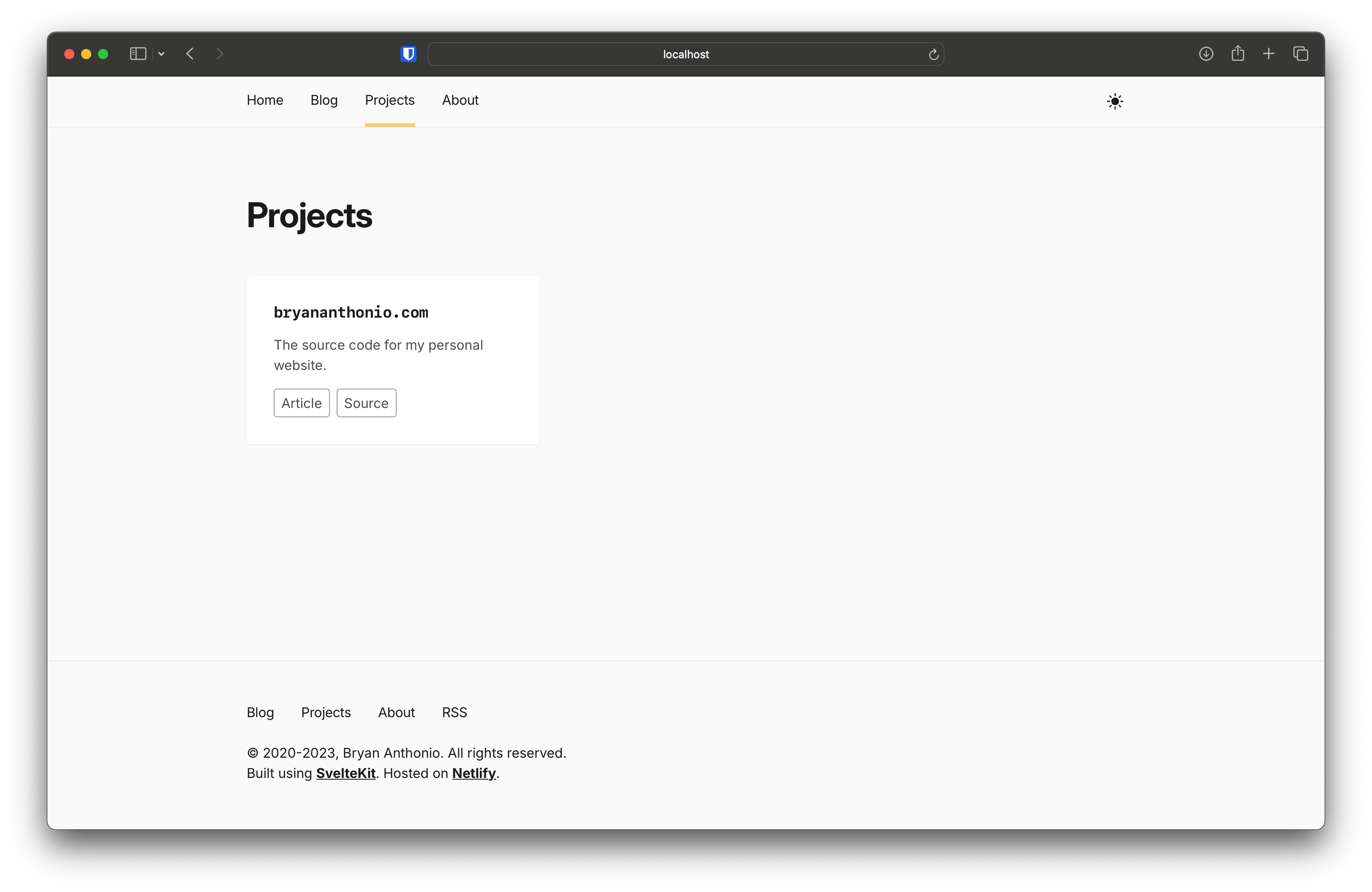
To that effect, I added a new page to showcase my side projects. There’s not much content on this page right now. But that will change in the future.
Page Layouts#
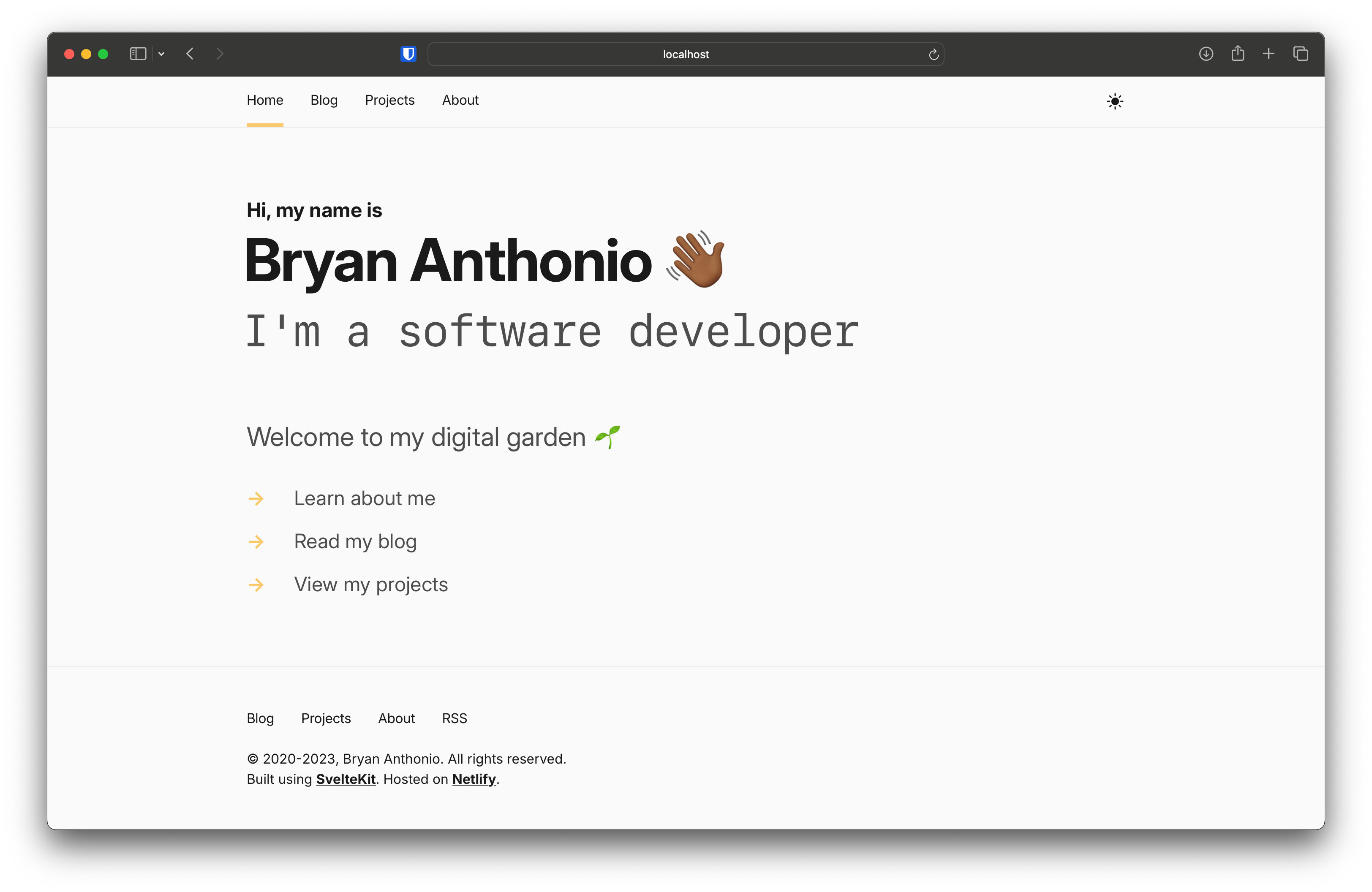
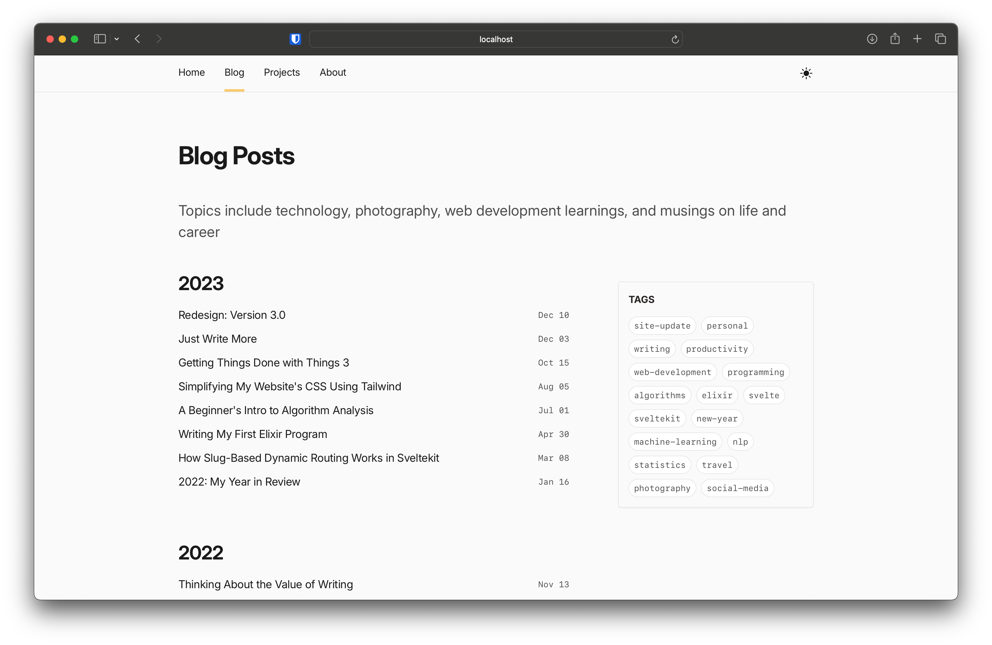
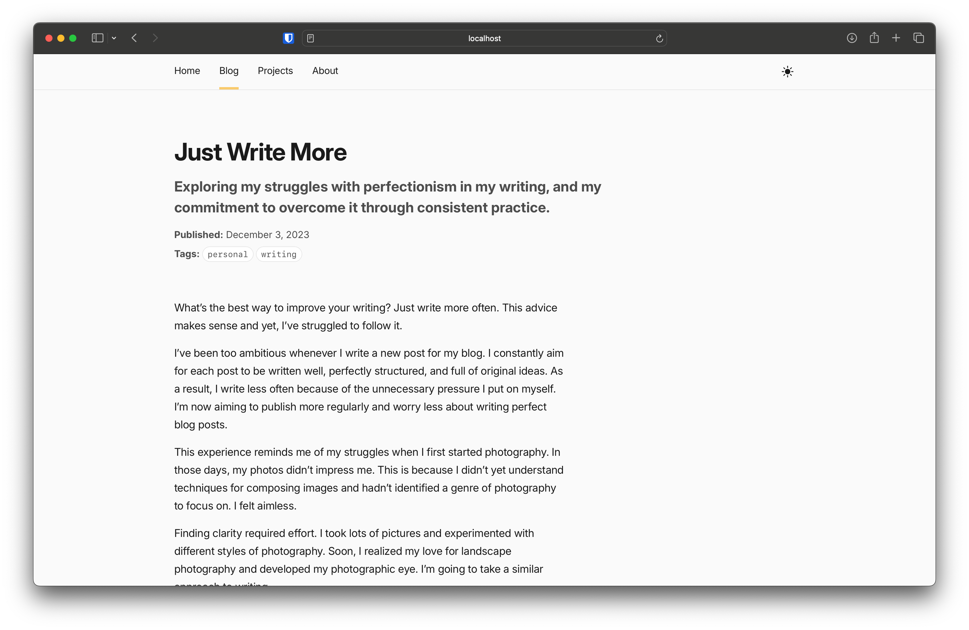
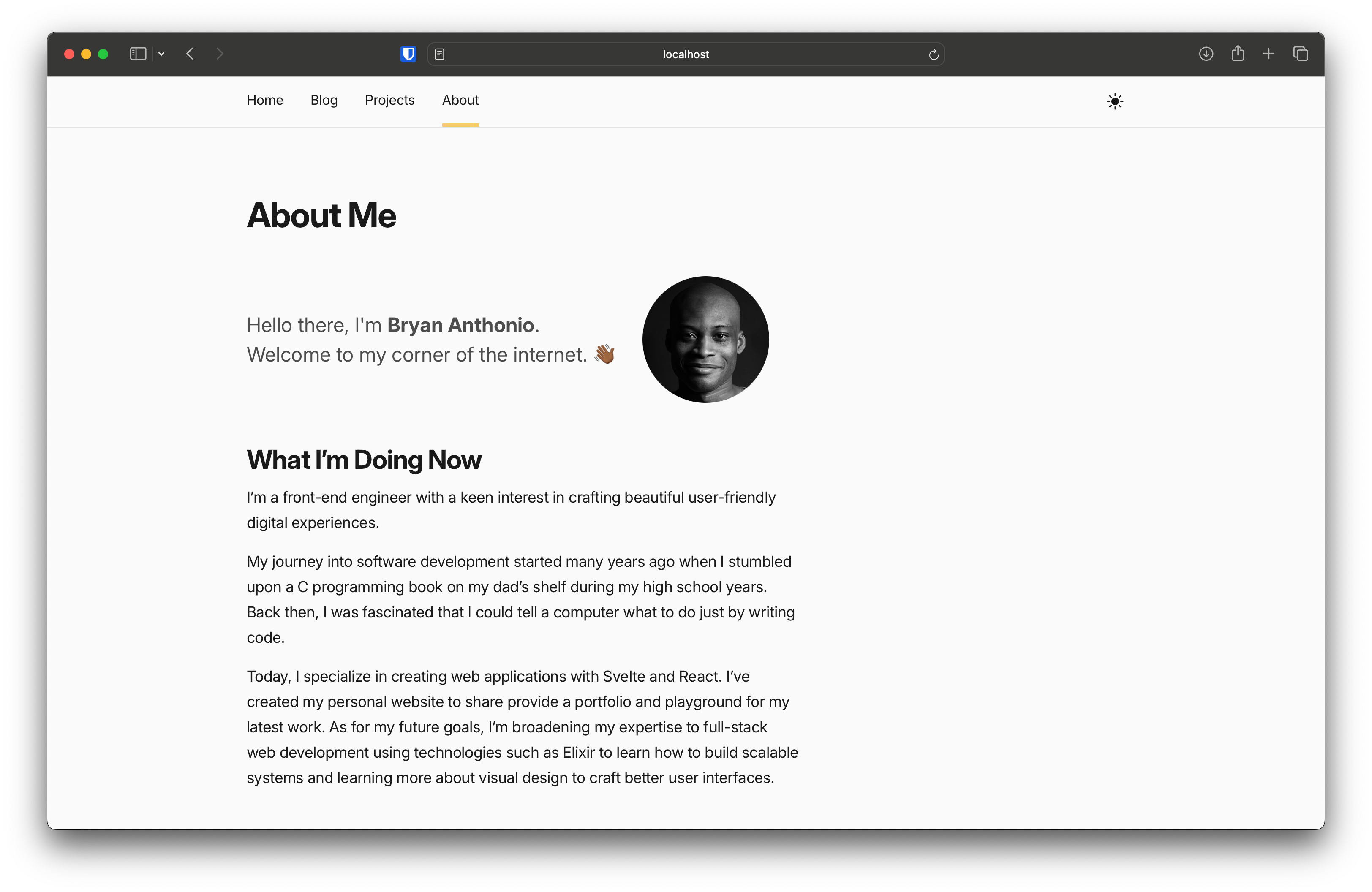
Here are some screenshots of the latest design.
Landing Page#
Blog page#
Article page#
About Me#
Projects#
Design Inspiration#
As I worked on redesigning the layouts of each page, I drew inspiration from these websites:
-
Brittany Chiang - This website provided suggestions on structuring landing page headers.
-
Tania Rascia - I liked the simplicity of the Tania’s layouts for the Blog and Project pages.
-
Josh Collinsworth - Here, I got the idea to add links to other pages on the landing page. I also took some pointers here on structuring the layout of blog posts.
-
Josh Comeau - I thought the animated arrows on Josh’s page were a nice touch so I added these to my landing page.
Honorable Mentions#
I like Stefan Zweifel’s Reading page. Initially, I planned to add my own Reading page in this update, but opted to include it in the future.
I’m also a huge fan of Maggie Appleton’s website. The typography and animations impress me! I need to learn more about typography and CSS to come up with something equally clever.
Conclusion#
I had a lot of fun putting together this redesign. Indeed, this work marked a significant evolution in my design skills and my vision for my website. I’m only just getting started in my design journey and look forward to seeing what comes next.